
Flexport
Quotes View Redesign

Flexport is a licensed freight forwarder that manages the complexity of international trade by leveraging software to automate away hefty transaction costs and improve the user experience for brands moving shipments. As a result, Flexport's online dashboard gives clients more visibility and control over their supply chain than ever before in this industry.
Flexport has laid a foundation for great design to happen, but I was approached to complete an overall redesign of the Quotes View from a visual design & UI perspective. The current design efficiently communicated a minimum of what is needed for clients from a usability perspective, but they believed there was room for improvement.
Process
My design process was grounded in developing an understanding of the design challenge and user goals and then moving into analyzing the current design to identify needed improvements. I wireframed those ideas, designed my initial concept, and iterated on my design while moving toward higher fidelity. Validation and further iteration was not within the scope of this project, but I recommended user testing of the high fidelity design and further iteration based on user feedback from several rounds of testing.

Identify Context
I made a few design assumptions to kick off my design:
- Visual elements are based on current Quotes View and style guide
- Maintain sidebar navigation for consistency throughout client app
- There is no interaction with the table other than viewing the quote in further detail
To set proper constraints and measure success, I chose to identify a potential use case for the design.
Situation: Ryan views ‘Active’ quotes.
Motivation: He needs to manage his company’s upcoming freight shipments.
Outcome: Ryan selects a shipment that he wants to view in greater detail and assess quotes from different carriers.
Ideate
By setting context with the use case and analyzing the current design, I established the information, functionality, and page components I wanted to incorporate in Quote View. Below is a brief outline of the elements for each area of focus:
Page Components
- Top Navigation
- Sidebar Navigation
- CTAs
- Icons + Text
Information
- Quote Type: Active, Accepted, Expired, All
- Shipment details: Name, Freight Type, Origin, Destination, Distance, Ship Date, Receive Date, Weight, Volume
Functionality
- Reorder fields
- Order view by certain fields
- View Quote Detail page (carrier bids and breakdown of charges)
Design
Wireframing
I translated my ideas into wireframes to explore some of the design concepts I had in mind. These are just a few of the wireframes before I got started designing in Sketch:


Setup
I started with a Bootstrap Sketch UI kit to design for desktop since +75% of sites are based on this. Using this grid and box model helps me communicate with engineers and it’s also a good transition since Flexport uses Bootstrap.
Style Guide
Pulling elements from Flexport's style guide, I used a standardized style allowing for greater ease of implementation and consistency with the current site’s design.
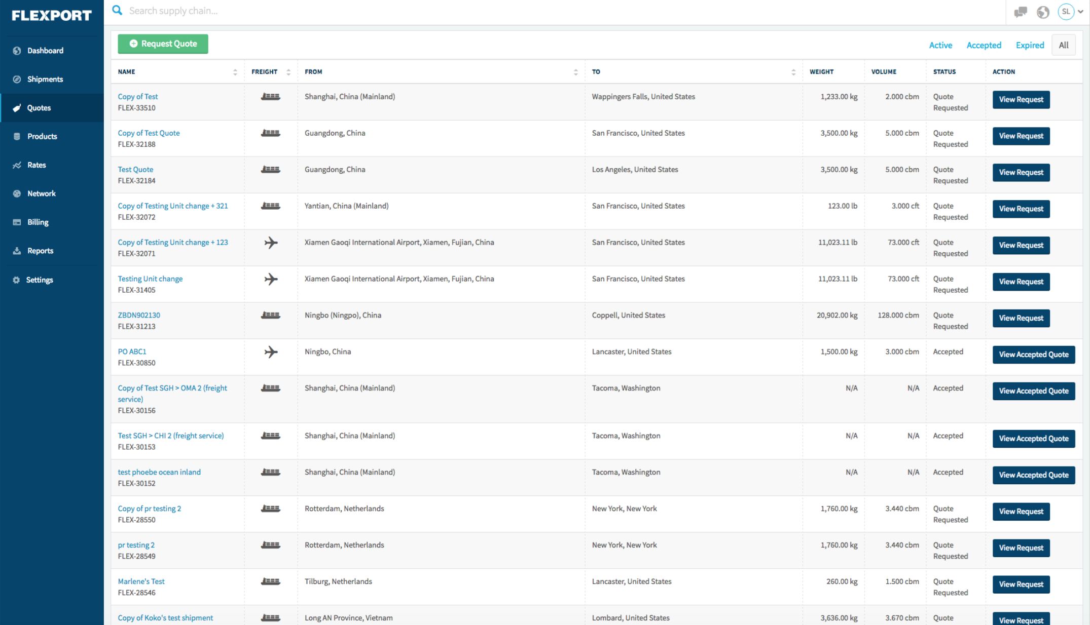
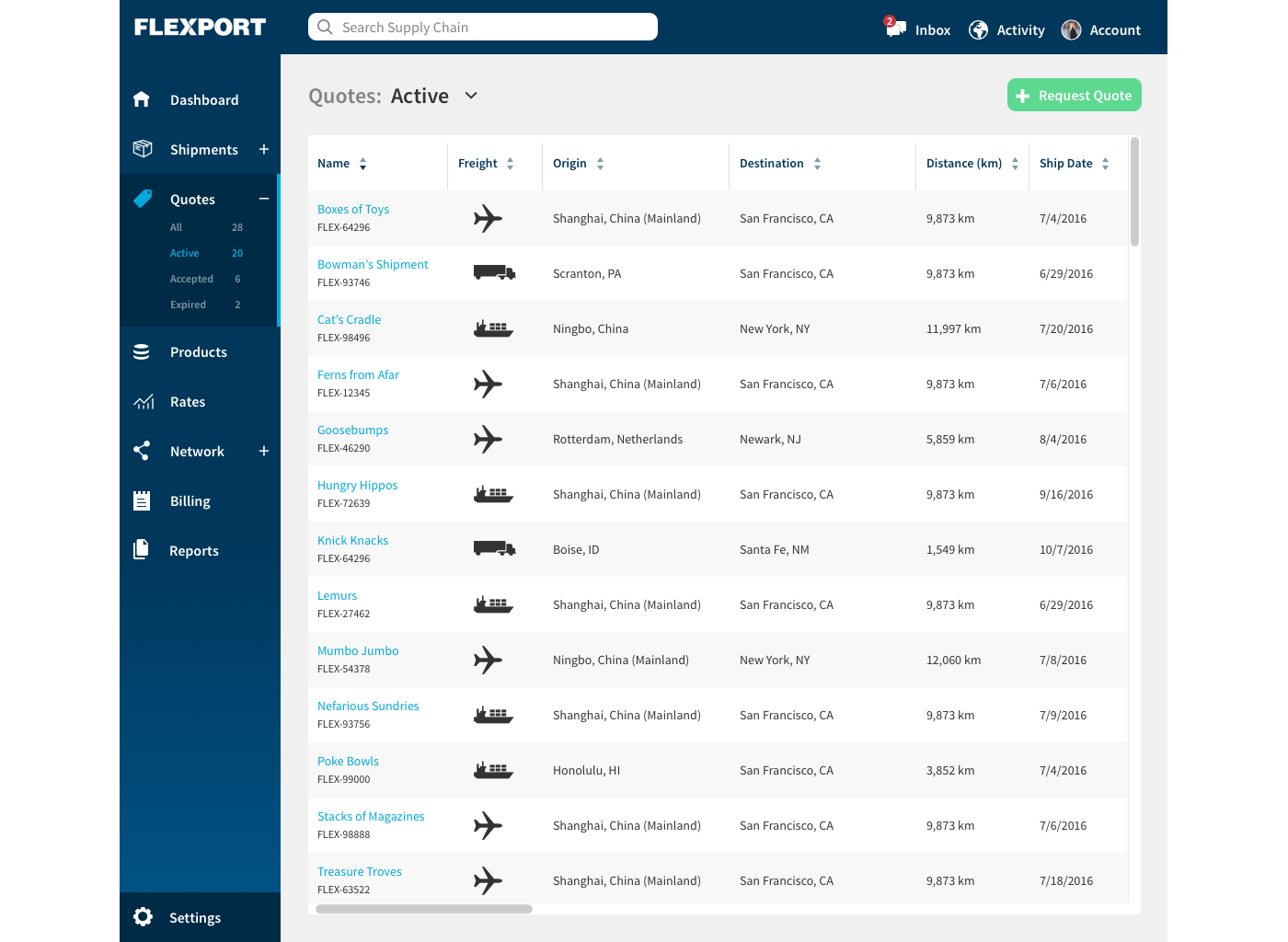
Before & After
Interface
- The dark Flexport blue for both the sidebar nav and the top nav gives the structure of the interface a cohesive look.
- Text paired with larger icons avoids ambiguity improves legibility.
- A gradient of blues directs the user’s eye downward to the new location of ‘Settings’.
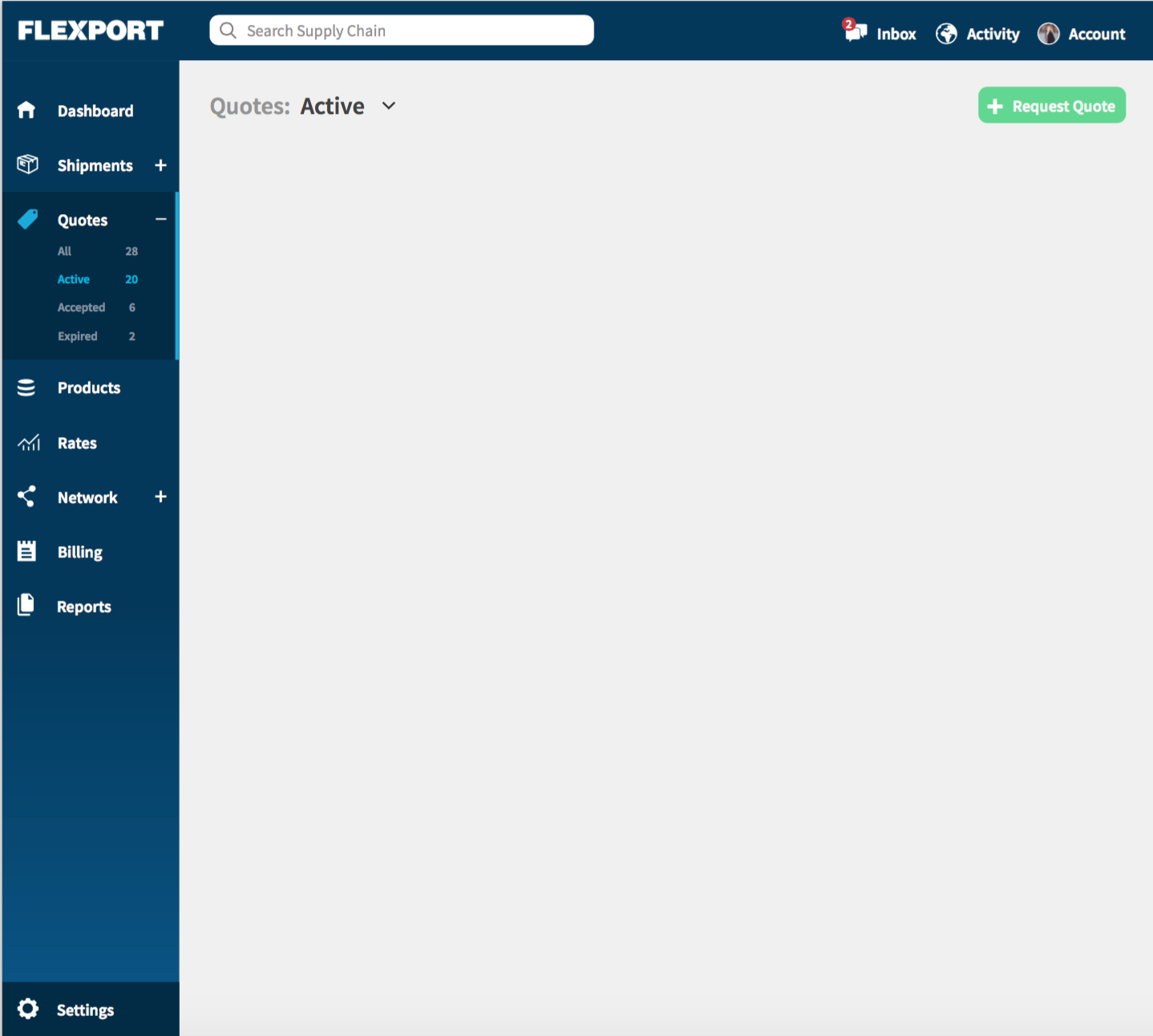
- Submenus for the side bar nav provides the user greater control over selections. For Quotes, this allows for the different types to be shown and selected here, freeing up space in the table. The type of quote can also be selected from the drop down.
- Distinct icons provides clarity in the top navigation (ex. dashboard icon and activity icons were given different images in the top nav)
- The main CTA, ‘Request Quote’ is prominently placed and shown in the green action button color.
Table
- Styling alternating rows differently increases the ability of users to distinguish between overcrowded data in multiple rows and columns.
- Based on the assumption that there is no interactivity with the table other than clicking into a quote to view in further detail, I removed the CTA button show on each line. Instead, the name of the quote is clickable - indicated by the blue color and the hyperlink UI.
- The table features continuous scrolling, and the table header is fixed so the user can always reference the column names.
- Functionality filters the columns so clients can customize tables. I played with adding a symbol to each column header to indicate the columns can be reordered, but it appeared cluttered and decreased legibility. However, the functionality to drag and reorder columns should be built in.

Next Steps: Validate and Iterate
Given more time and access to Flexport, I recommended the following next steps:
- Test the new Quote View design with a group of 5-6 current users to see if the information and functionality provided is an improvement to the current state.
- Record test sessions, map user pain points and insights by theme, and incorporate solutions into the design moving from medium to high fidelity.
I’d also explore:
- Slide left transition for Quote Details to appear next to the table within Quotes View
- Grouping sidebar navigation items groups for greater clarity/organization
- Settings for the table view to include +/- column fields assuming Settings in sidebar nav does not already include this (note: I assumed Settings would include the preference to show information in either standard or metric measurements.
- Personalizing the interface for clients - include company name and logo in global nav