Eventbrite: Mobile Design
Rebuilding Search functionality to improve Usability
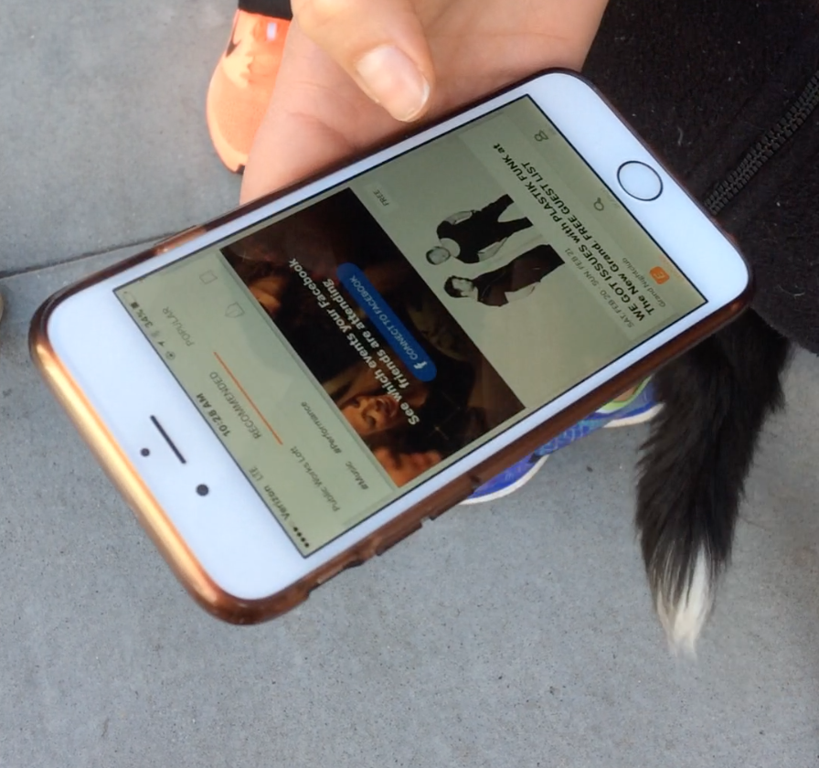
Eventbrite began as an online ticketing platform for event organizers, and the acquisition of Lanyrd in 2013 marked its evolution toward a two-sided marketplace catering to both event organizers needing to manage ticket sales and people looking to discover events in their area. Eventbrite's app made the fierce cut for a place on my iPhone's home screen, and for good reason - I use it regularly to get tickets for events and to easily pull up my ticket when checking in. However, for all the events I've been to that required me to snag a ticket through Eventbrite, I realized I've never once used it to seek out upcoming events. Why?
With this question in mind, I opened the app to search for events and encountered some hangups a few taps in. Navigating to their website, I found the functionality the app was lacking, but couldn't help thinking the shortcomings on mobile signaled a missed opportunity to increase usage of the app and potentially increase ticket sales by providing event organizers with a large, organic audience within Eventbrite's own network. I set out to see if other users experienced the same painpoints related to Eventbrite's search capability and explore design solutions based on findings from guerrilla usability testing.
Disclaimer: I'm in no way affiliated with Eventbrite. This is a personal project I did to further my user research and mobile design chops.
Design Process
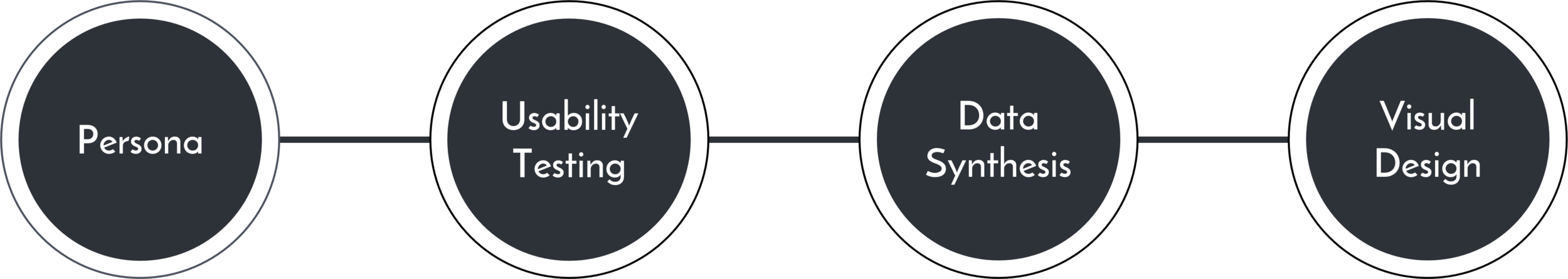
Persona
Meet Jake! He's the provisional user persona I crafted to help me identify a target audience to test. Given the resources, I would back up Jake's demographics, problems, behaviors, and needs with real data and real people, but given the scope of the project this was a great starting point to help me design intentionally and with the user in mind.


Usability Testing
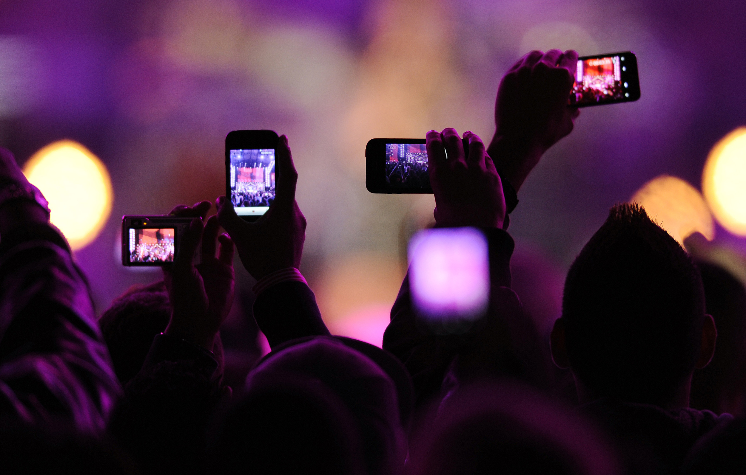
Ideally, I would recruit participants that fit Eventbrite's market and align with my persona, but guerrilla usability testing provided an incredible amount of value and insight given that it only took an afternoon to complete. Armed with my test script, I headed to Basik Cafe and Starbucks on Polk St. and recruited seven users (that reminded me a bit of Jake) who were willing to spare their time. I gave each participant a series of prompts and recorded their interactions and thoughts while using the mobile app.
Prompts 1-3 were based on the scenario that the participant wanted to find an event fitting specific criteria while a friend was in town visiting.
Prompt 1: Imagine that your friend who really likes to go to concerts is coming to visit you in San Francisco. Show me how you would find an event in the city that they’d enjoy.
Prompt 2: Your friend will be here tomorrow (Sunday) and you have a budget of $30, how would you narrow down your options?
Prompt 3: Choose an event for you and your friend to go to. You want to learn more details about the event, show me how to do that.
Prompts 4-6 were based on the scenario that the participant personalized his profile on the app and wanted to find an event based on his preferences.
Prompt 4: You want to personalize the app to tailor the event results to your interests, walk me through how you’d do that.
Prompt 5: Now that you’ve selected a few types of events that interest you, you want to search for an event based on your preferences. Find an event based on one of your selections.
Prompt 6: What do you think the “recommended” tab in Discover is showing you? Would you be interested in these events?
Data Synthesis
Reviewing each video, I wrote a quote or insight for every relevant point a participant made during his usability test and grouped them into categories.

It was apparent that Prompt 2 was a challenging task across all users, and digging deeper into the pain points associated with finding an event fitting certain criteria, I identified three main issues which I then set out to fix:

Visual Design
To flush out exactly what the new search flow would look like and what would need to be accounted for, I wrote a design story to work through the main, edge, and corner cases that might arise. I constantly refer back to the design story to ensure I don’t miss something critical later on in the process that would require me to change the UI.
High Level
After running a search by event type and location, results can be viewed in list or map format and further sorted by date categories. A user can also filter event results by distance and price range through the filter drop down.
Main Use Case
A user navigates to the 'Search' tab from the default app homepage, the 'Discover' tab. He types in or selects an event type and location to run a search. He can access the filter drop down menu from the search results page by pressing on the filter call-to-action to further narrow down the search results by distance and desired price range. Also from the search results page, the user can scroll through date categories to further sort events. One option, 'Choose Date', presents a calendar screen to appear with the opportunity to select a single date or date range.
Edge Case Flow
If a user searches a keyword that does not return any event results, the application will suggest a related search - "Did you mean to search for __?"

From here, I sketched lo-fi wireframes to explore design possibilities before moving to medium and high fidelity in Sketch. The screens to follow highlight the design decisions I made to solve the three main pain points.


Clarity in app navigation and calls-to-action
To let users know where they are within the app, the top of each screen shows its title. To indicate interactivity, I used borderless buttons colored in the Eventbrite orange with a clear call-to-action title. When typing into a search bar, the user is able to clear their entry with the 'x'. I also added card style event types with fun background image pictures and improved the readability and legibility of the predictive text results.
BEFORE
AFTER


A more intuitive way to filter and view search results
The search results page looked cluttered with the map and events on the same screen. This, along with the vague icon in the top right, detracted from the availability of filtering functionality. The action of the back arrow was mimicked by the search bar along the top. To free up space, I removed the back arrow and replaced the icons with work buttons. 'Map' allows the user to toggle back and forth from viewing the search results in map or list format while 'Filters' prompts the filter drop down to appear. The scrolling 'Date Bar' allows users to filter by date. I also spruced up the legibility and content of the event results.
Before
After


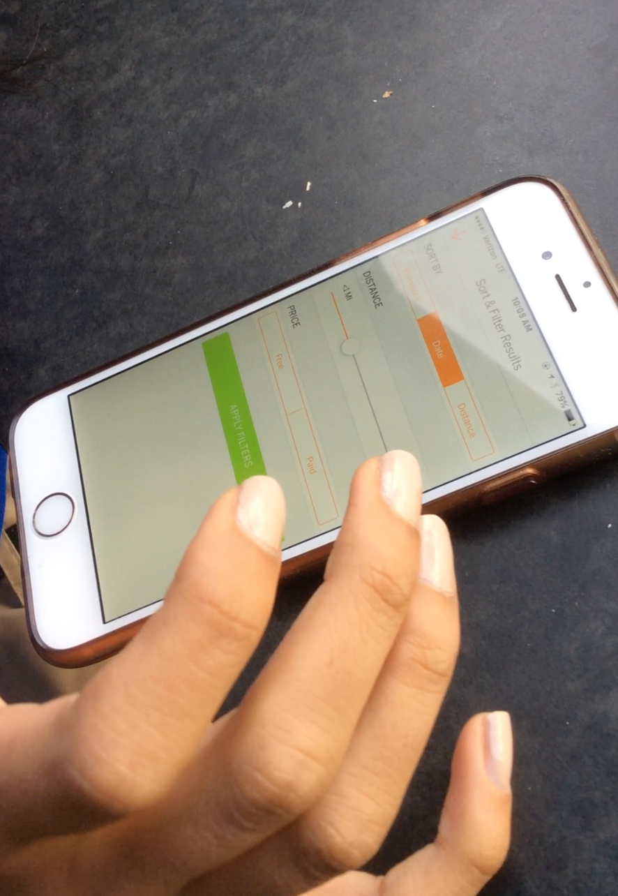
Improved filter criteria
The sort and filter menu looked bulky and featured a green call-to-action button that didn't fit with the app's visual theme. I shrunk the filter drop down to appear on top of the search results page, providing context and indicating to users they can click on the blurred background to return to the main page. While in the filter drop down, the header title indicates the app location and features the call-to-action buttons, providing consistency.
I removed the 'Sort By' criteria since the app should filter results based on the other filter and search criteria. For instance, if a user searches for events in Chinatown, the list of events should automatically order and place the events closest to that location at the top of the list. I added a number indicator to the distance bar to show users the exact selection and expanded the price options to include a range of prices for paid events. The distance and price ranges are just placeholders as effective ranges would need to be tested and validated.
Before
After

To expand on the 'Date Bar' mentioned in pain point #2, I wanted to give users a lot of options to narrow down the event results by date as I consider the time and day an event takes place to be a primary factor in a user's decision to attend. Scrolling all the way to the right, 'Choose Date' gives a user the most flexibility and control by allowing them to select a single date or a date range. Selecting this option, the user see the current date simply underlined, be able to select a date which would then highlight in orange, be able to add an end date, and scroll continuously through the calendar.
Similarly to the previous examples, the header title indicates the location within the app and features the call-to-action buttons. Hitting 'Ok' would bring you back to the event results page and 'Choose Date' would update with the user's selections.
After

Lastly, all of the high fidelity screens were combined to form a clickable prototype - have at it!
Design Reflections
Redesigning the search flow and enhancing the filter functionality for event results, I'm hoping to eliminate the majority of the frustrations I uncovered in my usability testing. However, this redesign is a hypothesis, and just that. Only through testing and tracking internal metrics could the success of the design be validated.
Thanks to my test participants and to Eventbrite for the opportunity to tinker with your app, you guys rock!