WeTravel: Redesigning the Trip Booking Process
Adapting to a new market through user testing & rapid iteration

WeTravel is an online trip management platform that allows group trip organizers to create itineraries, manage communication with travelers, and handle finances all within the site. WeTravel’s original target market was private, invite only group trips where the travelers knew one another. For example, it’s frequently used by MBA students to plan university trips and by yoga teachers to plan retreats.
WeTravel wanted to expand its offerings to include public trips open to all travelers. They came to us to help them change their product strategy and design to cater to both public and private customer segments. I joined the project on the UX team and took part in usability testing, pain point synthesis, ideating and rapid prototyping to redesign the experience of WeTravel’s trip details page, booking process flow, and final confirmation page.
With each iteration, we found users' comprehension of the trip details increase and they were able to navigate through the booking process with confidence and ease. We handed off the design in April 2016 and the redesign is scheduled to be shipped in the fall.

Design Process
Our design process was grounded in developing an understanding of the user and what they need to feel confident planning a trip. We used these insights to inform our design decisions and test them via rapid prototyping.

Usability Research
The redesign of WeTravel's booking flow needed to account for users going on both types of trips: public and private. A rudimentary critique of the existing site highlighted a few challenges for both kinds of travelers, but particularly those who might not know other people on their trip.

For the trip details page we noticed:
- Traveler information: There was inadequate information provided about the trip organizer and other booked travelers.
- Trip information: Key information was not prominent or scannable - we couldn't easily find basic trip details and some trips featured very little information. Additionally, trip photos were obscured in the hero header image.
- Layout: There was unused space on the page to accommodate better content layout. The trip itinerary, one of the more important pieces of trip information, was located at the very bottom of the page and was difficult to read because the background used user-generated pictures.
In addition to the trip details page, the booking flow - only one page where the traveler entered their payment information - felt abrupt and a bit untrustworthy. It was unclear if after this page the trip was purchased or there would be a chance to review. There was also a missed opportunity for up-selling trip add-ons and a lack of excitement when the trip was confirmed.
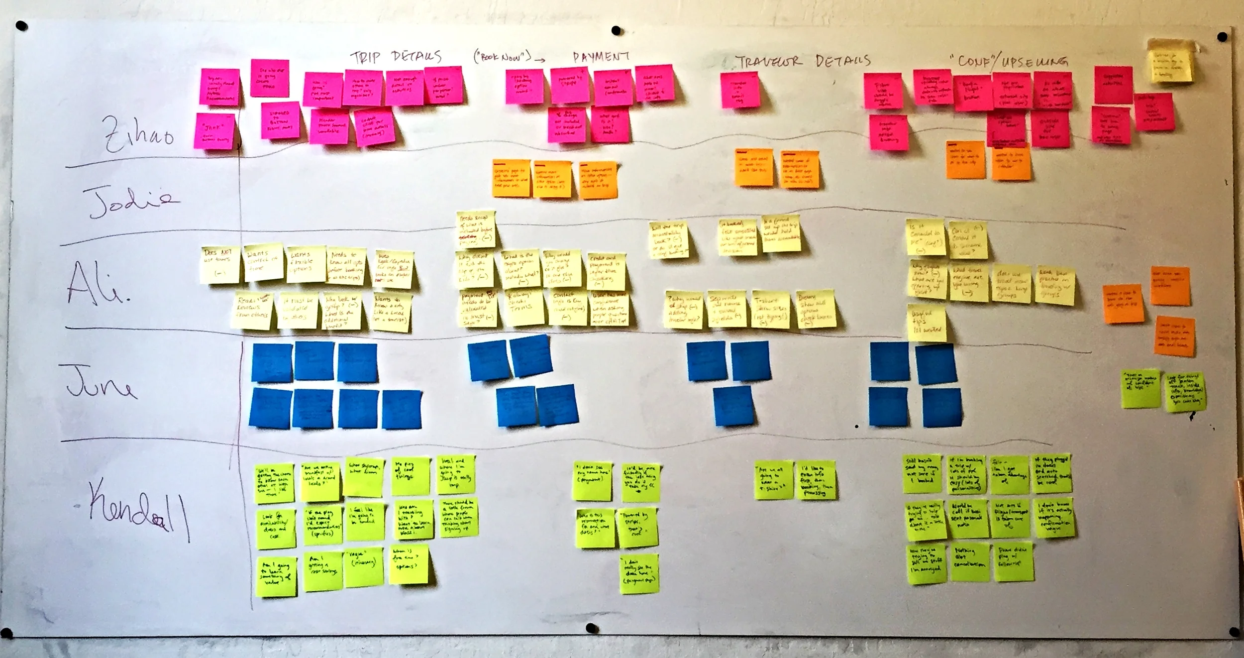
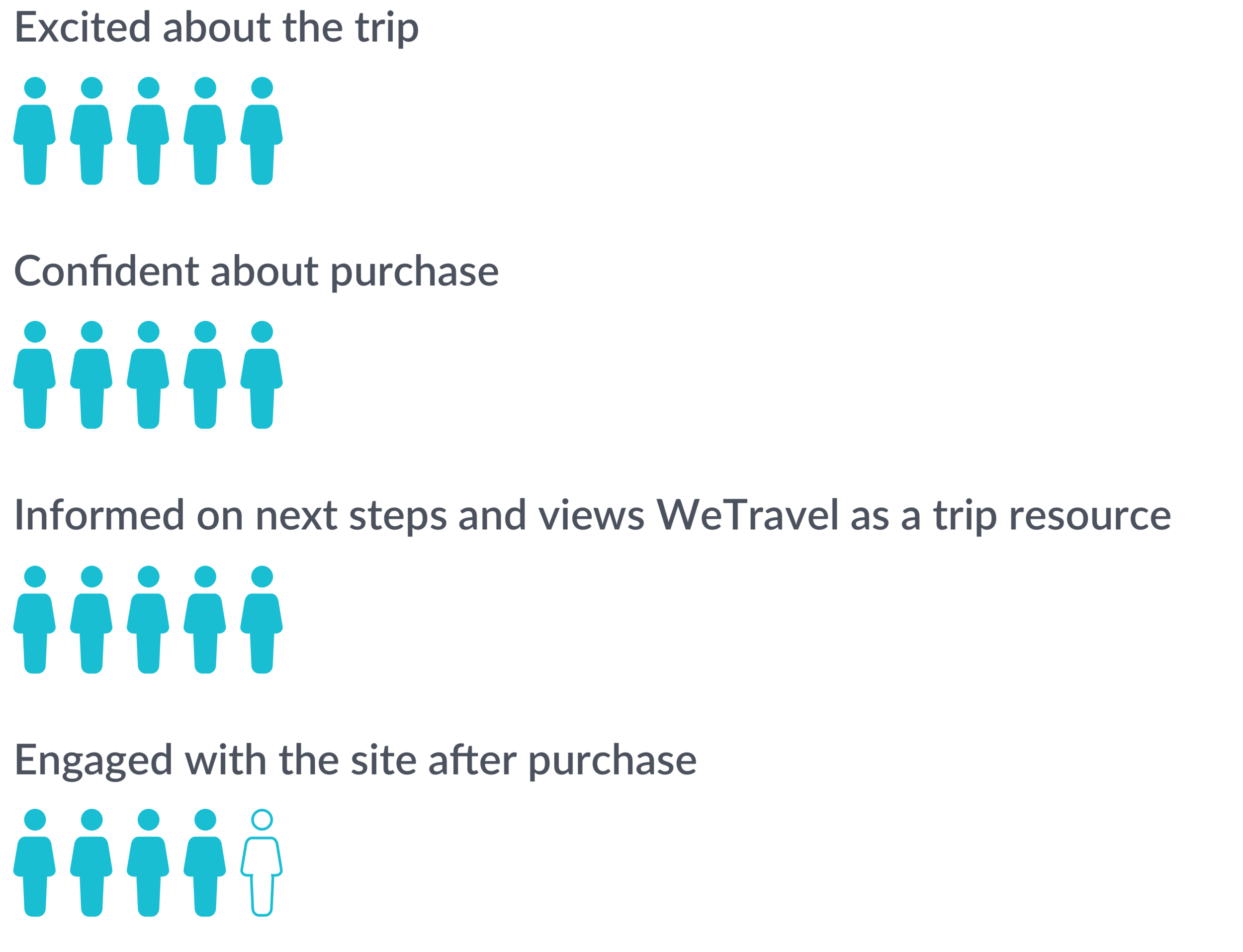
Next, we tested the existing site on five users who identified as travelers with experience booking group trips.
The results weren't so great, but our initial round of testing provided us with a lot of useful insights after we grouped the pain points into buckets based on common themes. This mapping revealed three main challenges with WeTravel’s overall clarity, flow, and confidence.

illustration by our amazing team lead: Chia Lin
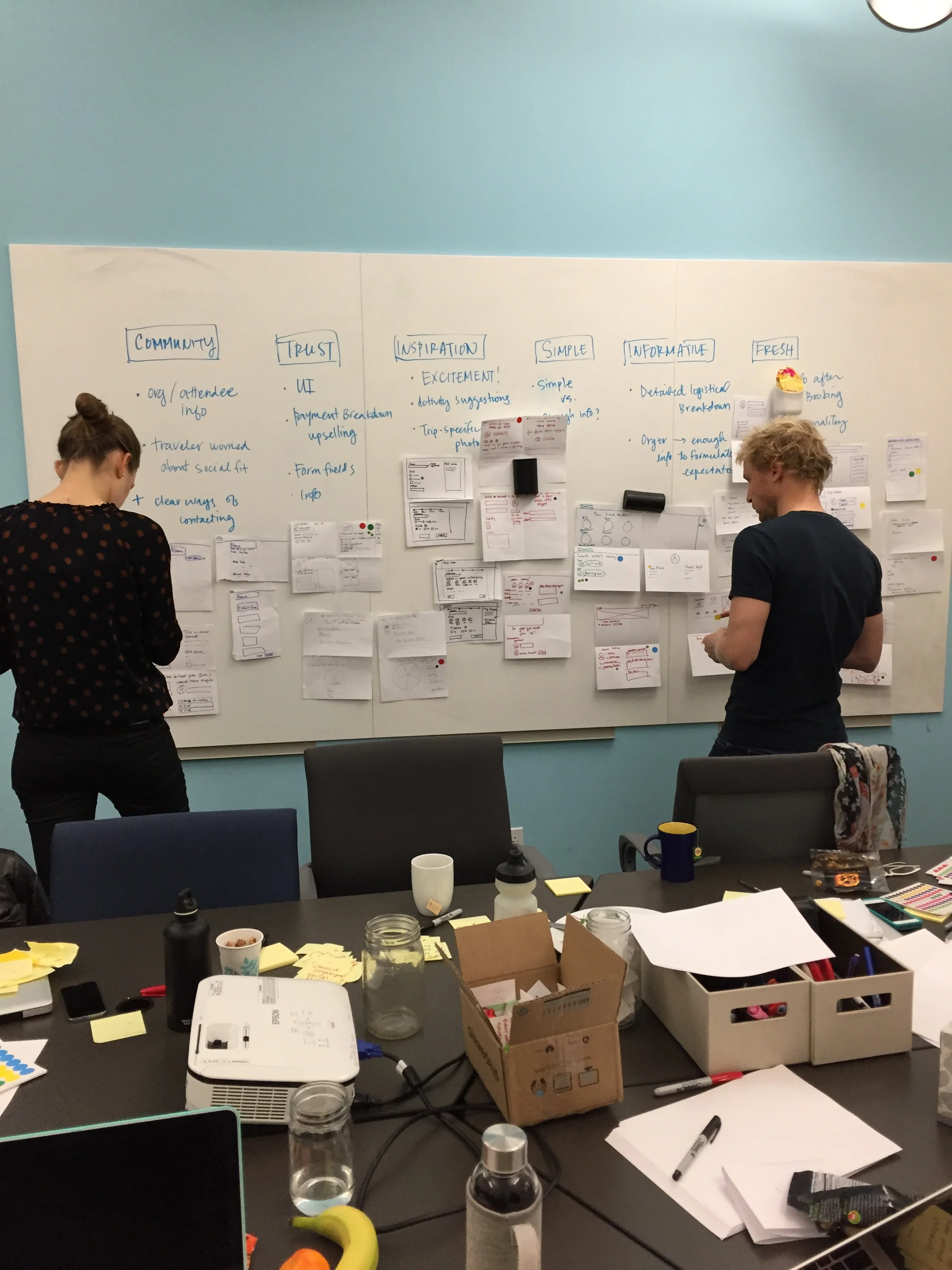
Based on our initial evaluation and testing, we developed a set of hypotheses to guide our designs and measure their effectiveness during each round of iteration and usability testing:
Hypothesis 1 - Improved information design will allow the traveler to find the information they need to feel confident booking with WeTravel.
Hypothesis 2 - Breaking down the booking process into individual steps will increase the user’s trust and confidence in WeTravel.
Hypothesis 3 - Compelling copy and information on the confirmation page will increase user engagement and up-selling opportunities.
Design Sprint
Now that we knew who we are designing for and what to solve for, we could move onto designing.. and redesigning.. and then redesigning those redesigns.
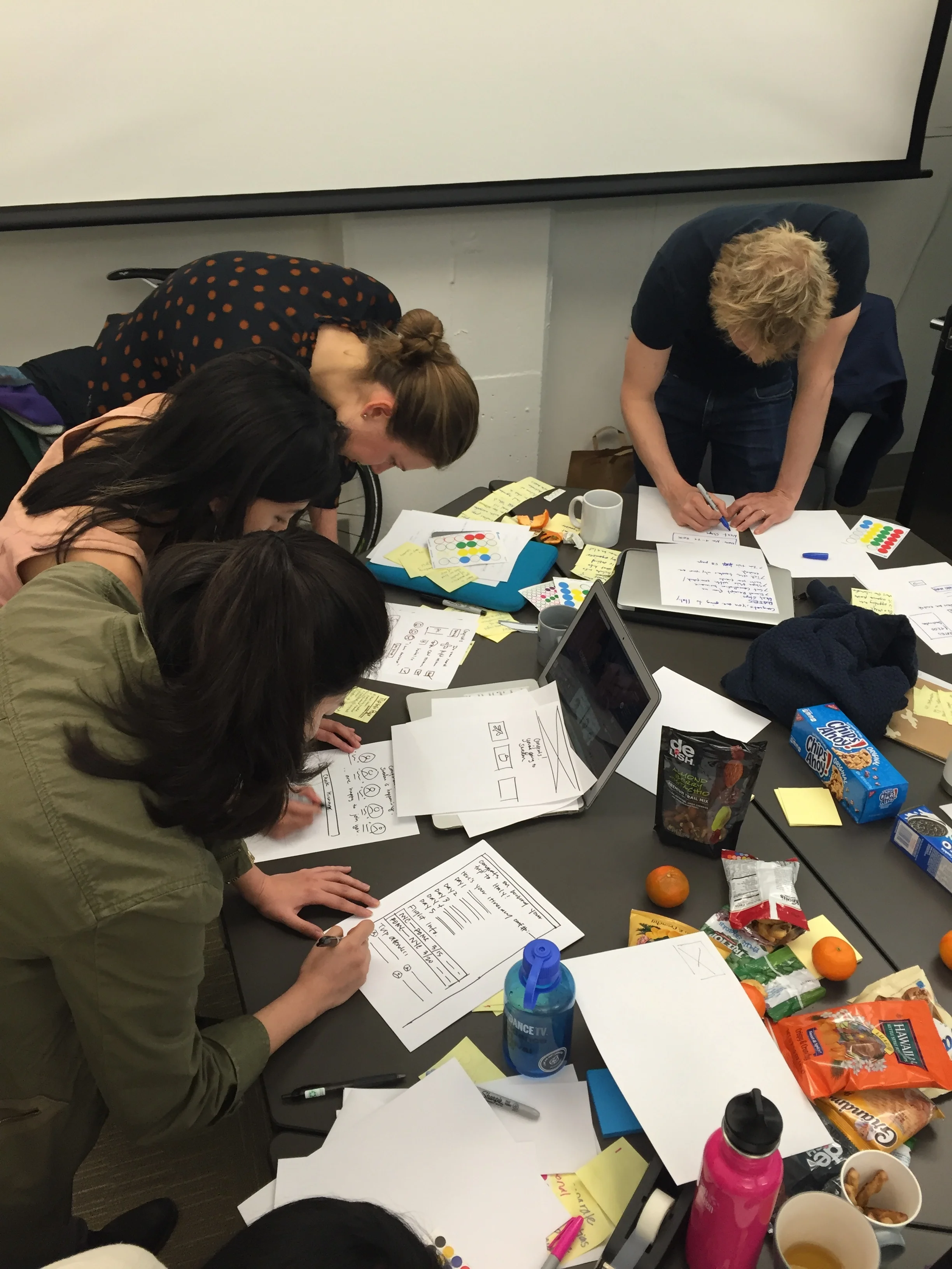
Prepared with enough snacks to power us through four hours of brainstorming and wireframing, the team and the WeTravel founders participated in a design sprint modeled after Google’s process. Our goal was to provide our stakeholders with context on user pain points and generate a wealth of possible solutions together. The process of rapid ideation and iteration started with lightening talks, quick five minute presentations on business objectives, user personas, and pain points, and progressed with a marathon of Crazy 8's.
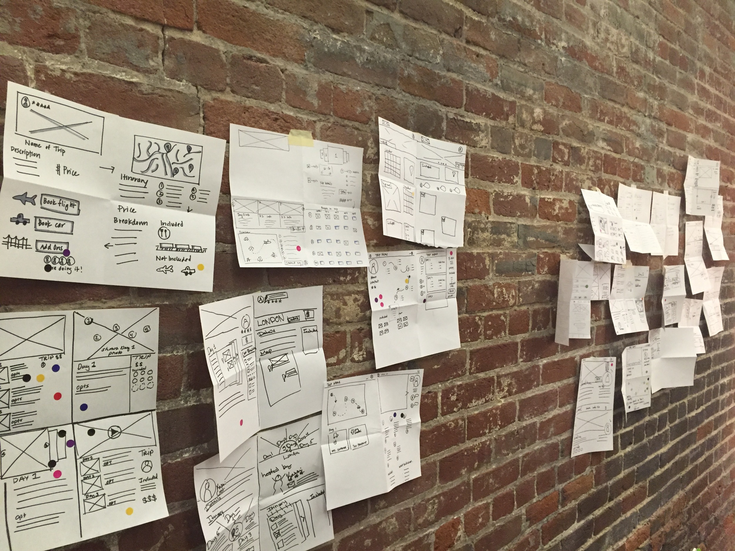
With our ideas down, we voted on the wireframes and features we wanted to take to higher fidelity and moved onto a series of design, prototyping, and testing.
Rapid Iteration & Testing
Over the next four weeks we completed four rounds of testing. We tested each prototype created in InVision on five users who self-identified as travelers experienced in booking group trips. After each usability test, we mapped user pain points by theme and incorporated areas in which users felt confused into our design iterations as we moved from medium to high fidelity.
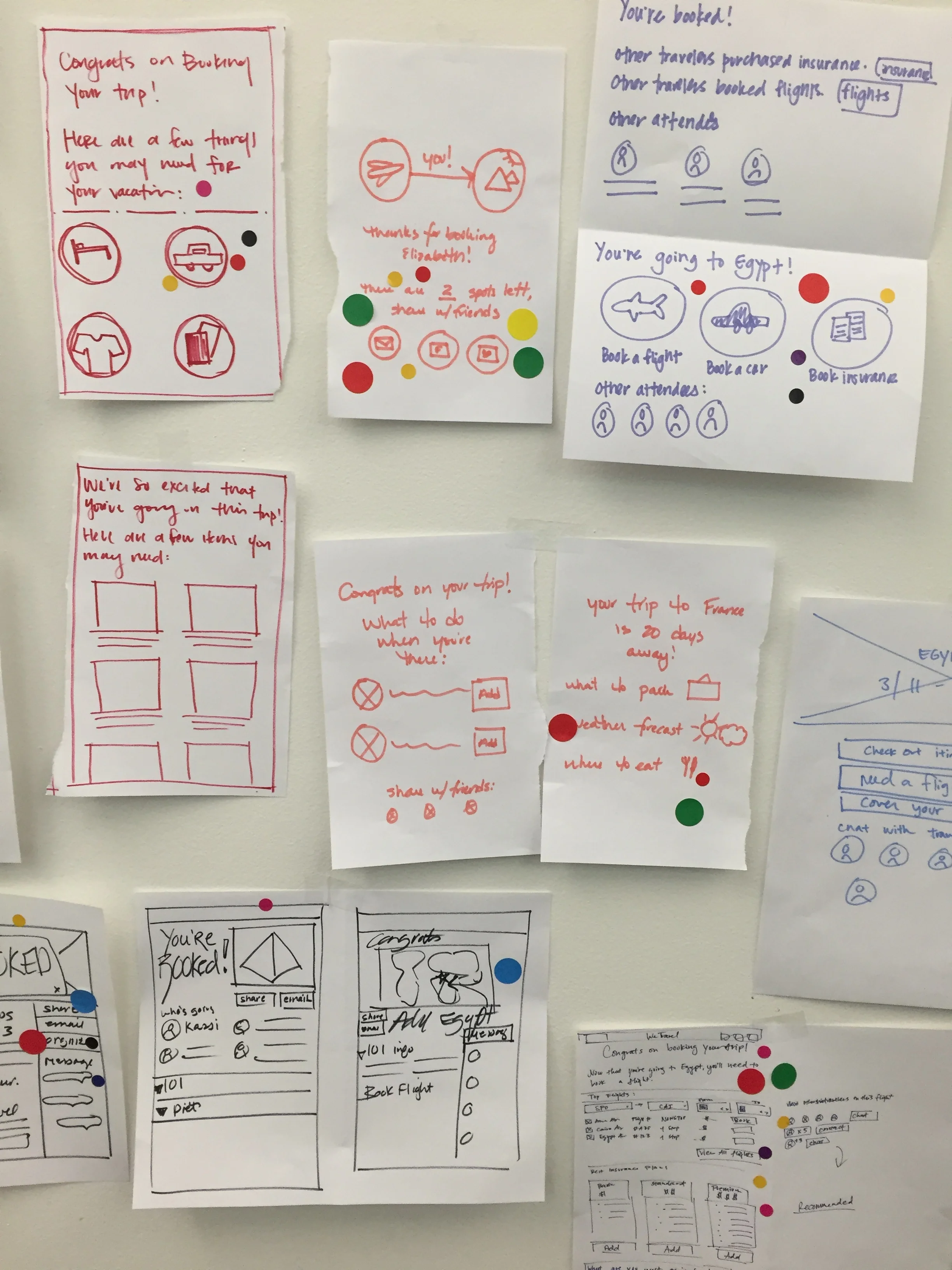
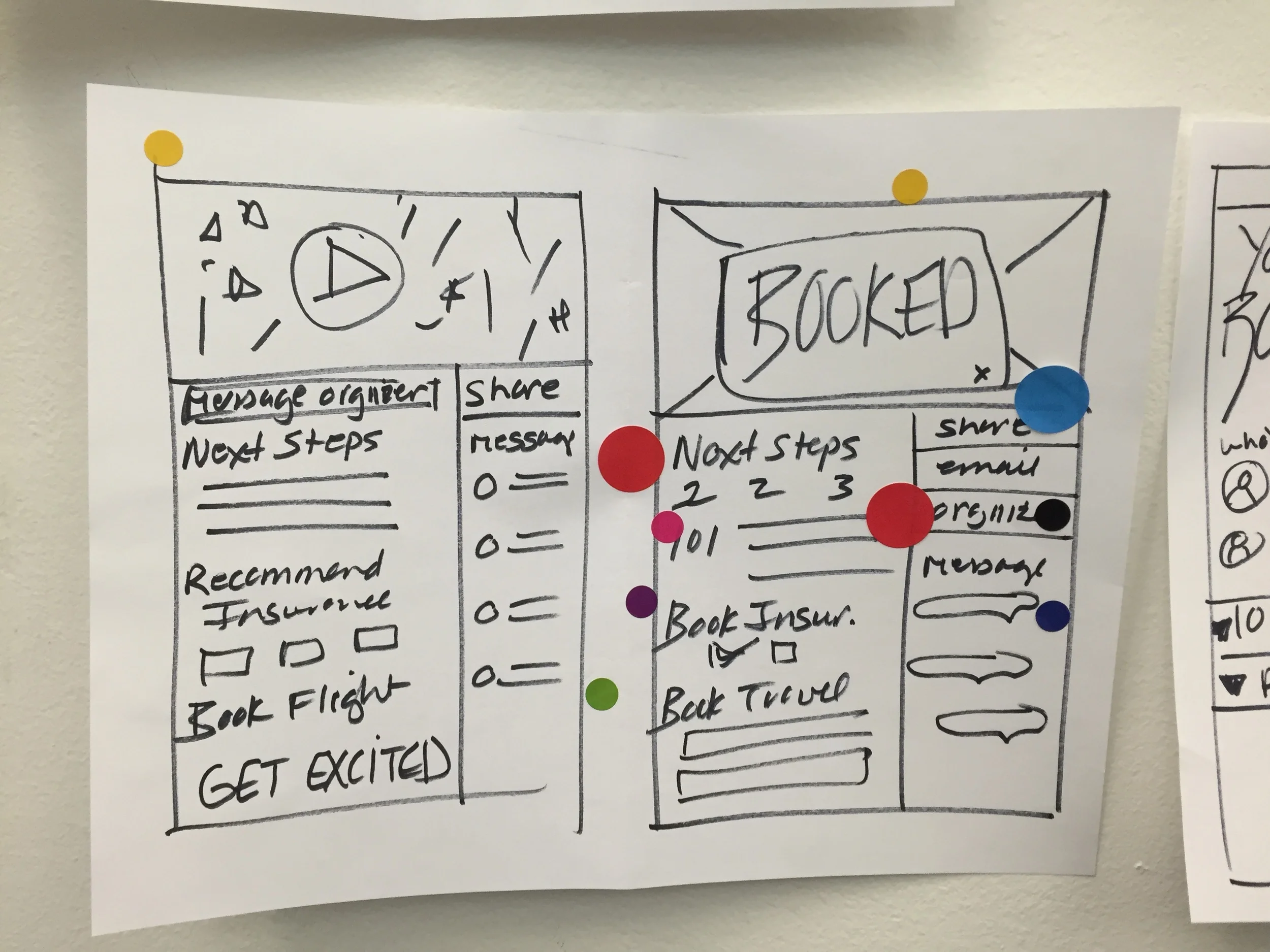
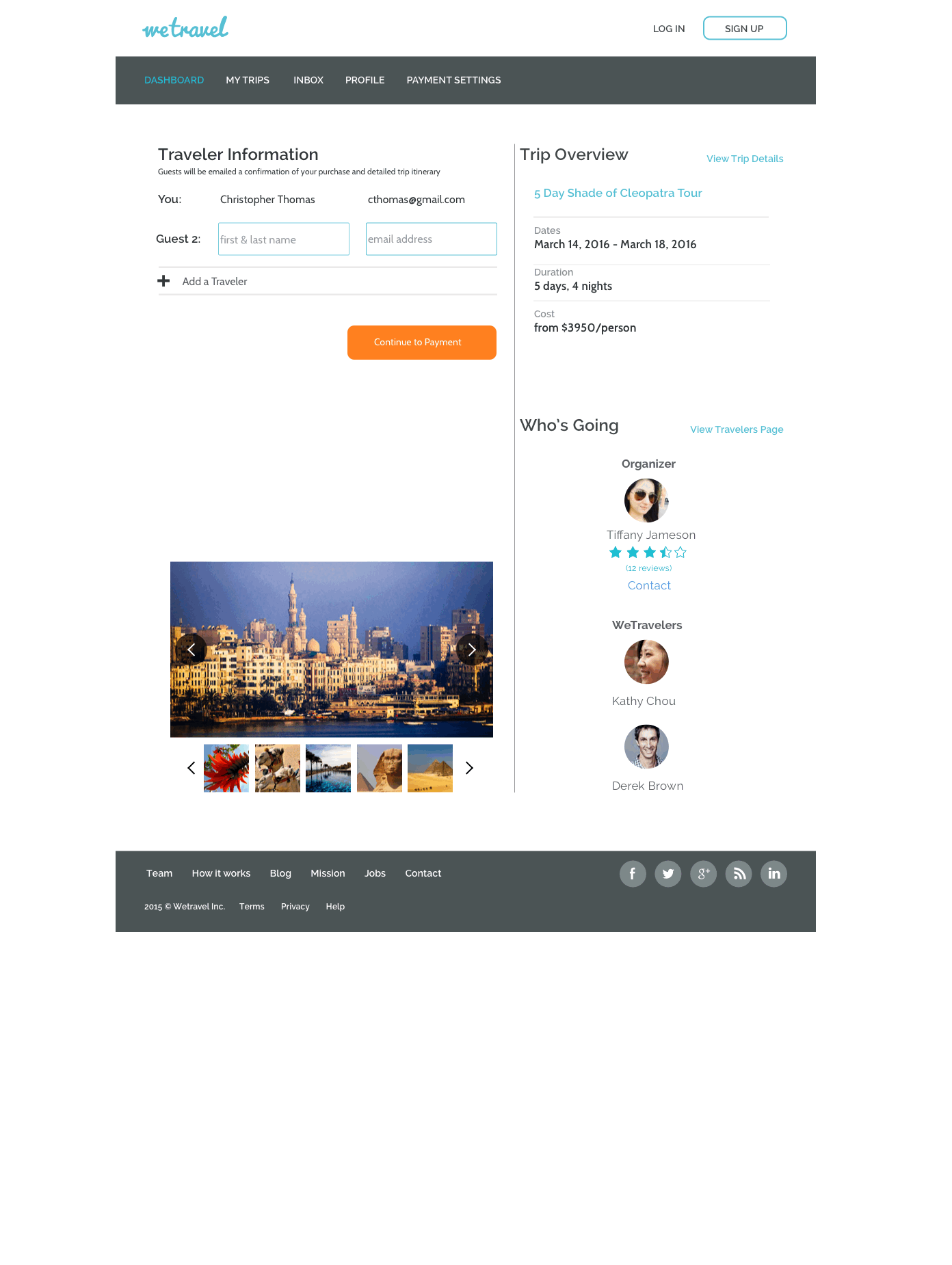
I took charge on the redesign and feature buildout of the 'traveler information page' - the first page of the booking flow after the trip details page.
From the iterations to the left, you can see the evolution of some of the design decisions made:
- Adding a progress bar at the top of the booking flow pages to indicate to users where they are in the booking process
- Providing the option to add an additional traveler and enter their personal information/select trip options
- Showing a breakdown of trip costs on the right side of the page to provide transparency and also indicate total amount due now at booking and remainder due at a certain date (highlighted in red to draw attention)
- Removing the trip organizer and other travelers from the booking flow to the trip details and confirmation page where the information is more relevant
Validation Testing
After four weeks of refining our designs, we had improved our prototype significantly and it was time to do our fifth and final round of usability testing. We had very positive results and were able to validate our three hypotheses by improving all areas we had initially identified pain points: clarify, flow, and confidence.
Trip Details Page


Traveler Detail Page


Payment Page

Review Page


CONFIRMATION PAGE


Book your own trip to Egypt with our clickable prototype here!
Design Reflections
In the beginning, the founders were a bit concerned that a longer booking process with additional steps would cause some users to drop off. However, we learned through usability testing that travelers felt more comfortable with the longer, but more comprehensive, booking flow because it provided them with a familiar breakdown when making a large purchase. Providing more detail and restructuring the trip booking process was a necessary step to make both types of travelers, those who book private trips as well as public trips, feel confident in their trip purchase.
Since our design process was heavily based on rapid iteration, we found it really useful at the beginning of the project to establish hypotheses and create a standard set of questions to ask during each round of usability testing. This helped guide us through the design process and effectively track and measure our progress as we moved into higher fidelity.