Zeguro: Creating Visual Identity
brand design for an early-stage startup

Zeguro is an early-stage start-up that efficiently manages the insurance claim process for small business owners by bridging the gap between insurance providers and those who handle repairs. They are working to bring transparency and simplicity to the insurance space by streamlining the process and directly connecting business owners to reliable, local repair shops and preventing future claims by creating risk models.
Provided with a series of low fidelity Balsamiq wireframes and an understanding of the founder's vision for their product, I worked as a visual designer on a team of five to develop Zeguro's brand identity. The scope of the project included establishing Zeguro's design principles, creating a style guide and component library, and applying the brand elements to high-fidelity UI screens for the on-boarding flow. With its visual identity established and product development underway, Zeguro is set to launch in winter 2016.
Design Process

Understand | Branding Workshop
To uncover the underlying brand principles and create a visual and verbal framework for Zeguro, we needed to understand how the founders envisioned their business. We had a general sense based on the name Zeguro, derived from the Spanish word seguro which means "safety", but we needed to dig deeper. We led them through a branding workshop to determine five core values to inform our design decisions and guide the business's style. To give everyone a familiar model to refer to, we kicked off the workshop by asking the founders to imagine Zeguro as a magazine and its users as their targeted readers. We asked:
"What kind of people would read it?
"What kind of activities, programs and lifestyles would it promote?
"What would you expect people to remember about this publication and take away from it?"
This gave the team insight into how the founders pictured their company in terms we all recognized. We then jotted down adjectives describing the negative and positive experiences of handling an insurance claim. After each prompt, we grouped similar adjectives into themes and discussed how we wanted those themes to relate to Zeguro.
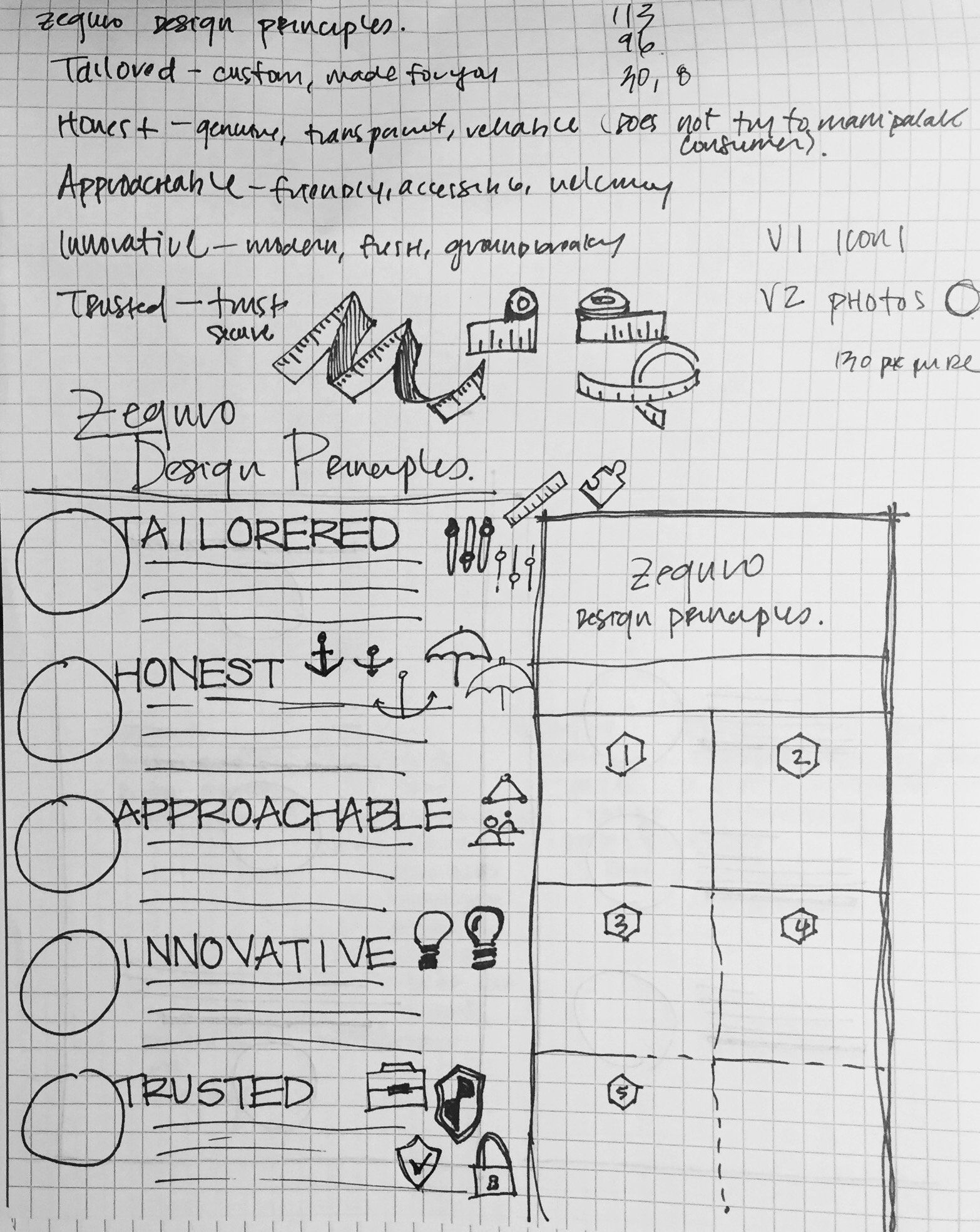
Through this, we identified five design principles that define Zeguro: approachable, trusted, innovative, tailored, and honesty.


Understand | Brand Experience Prototypes
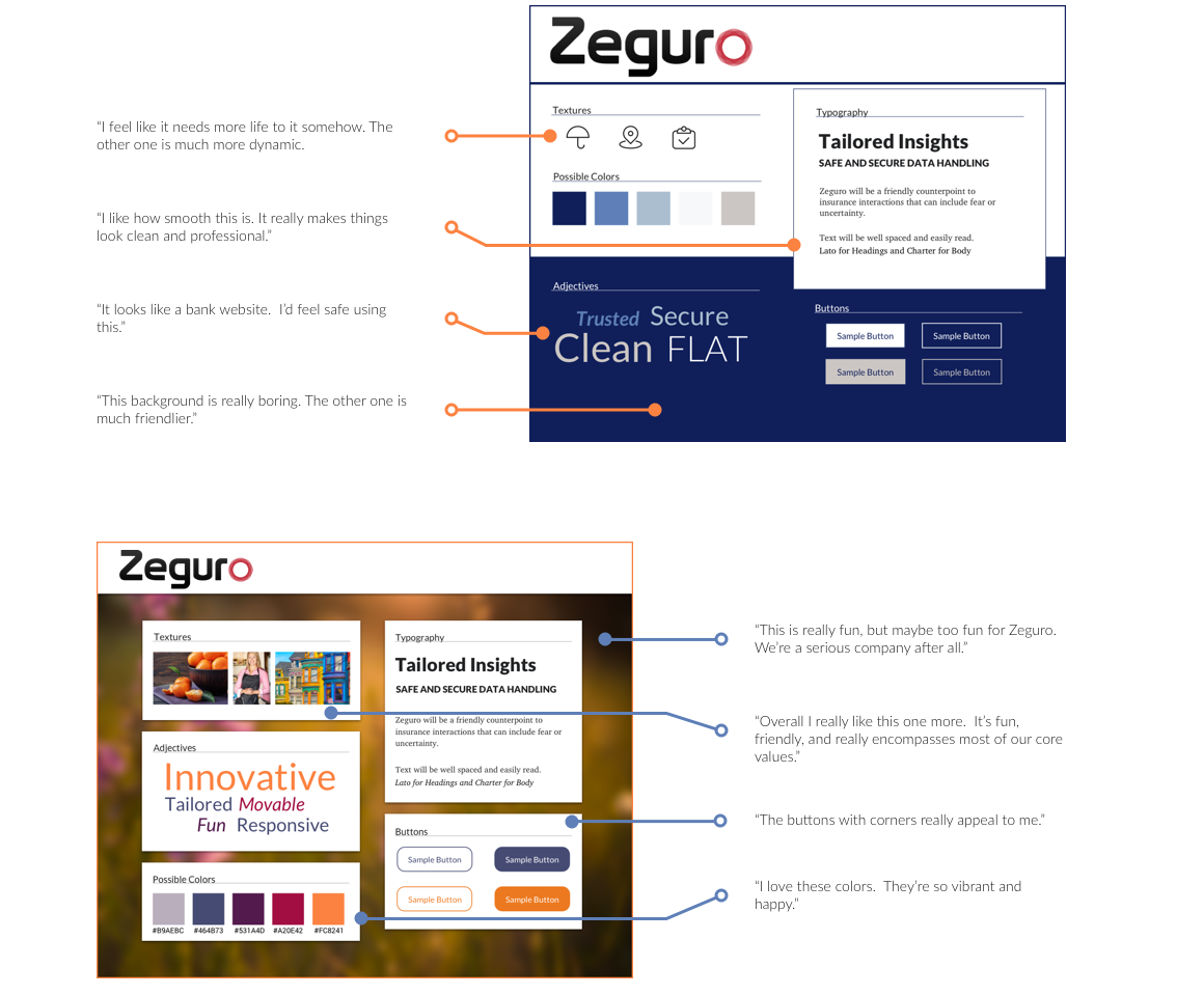
We visually translated the design principles into style tiles and asked the founders for feedback to get a feel for their aesthetic preferences.
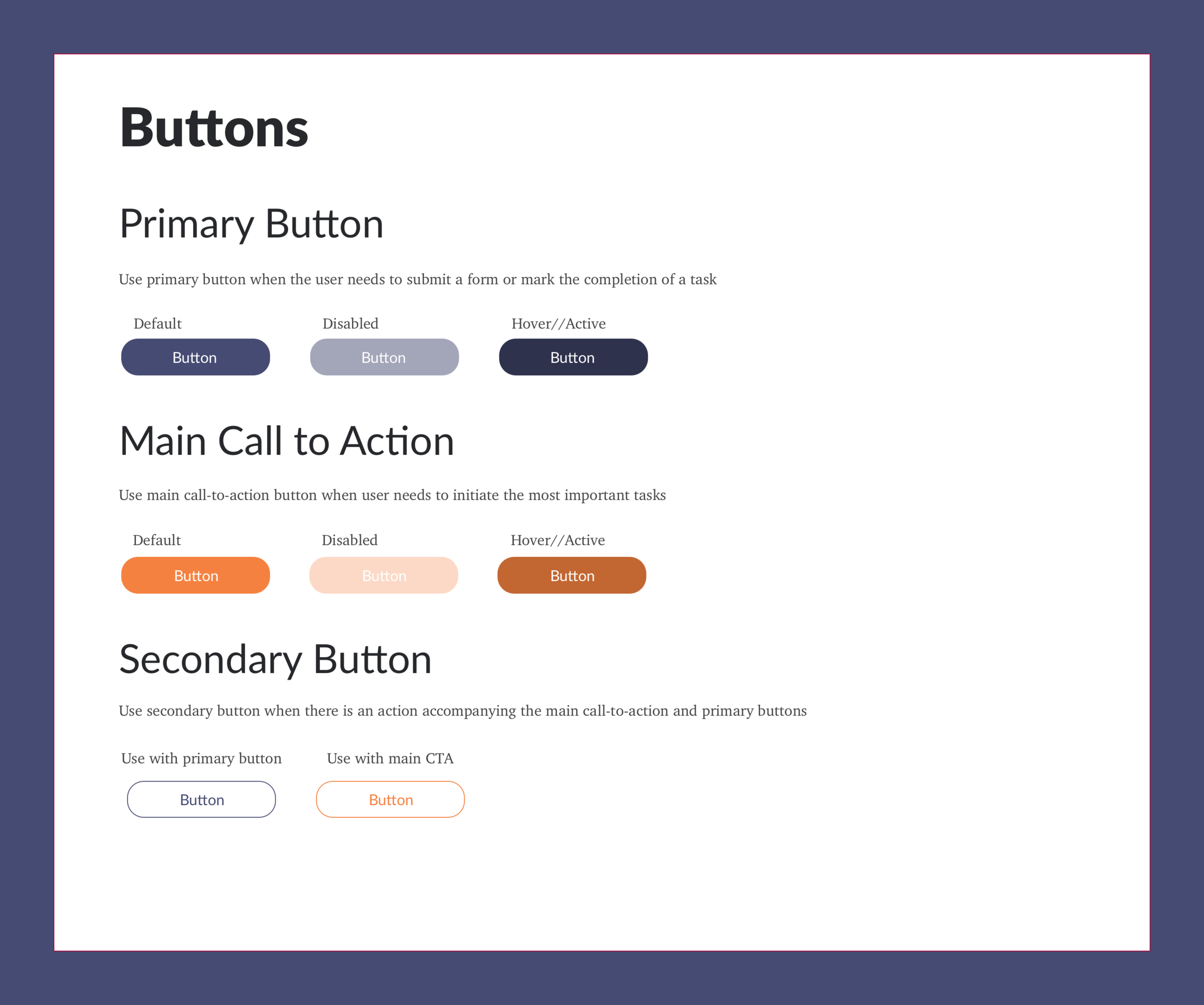
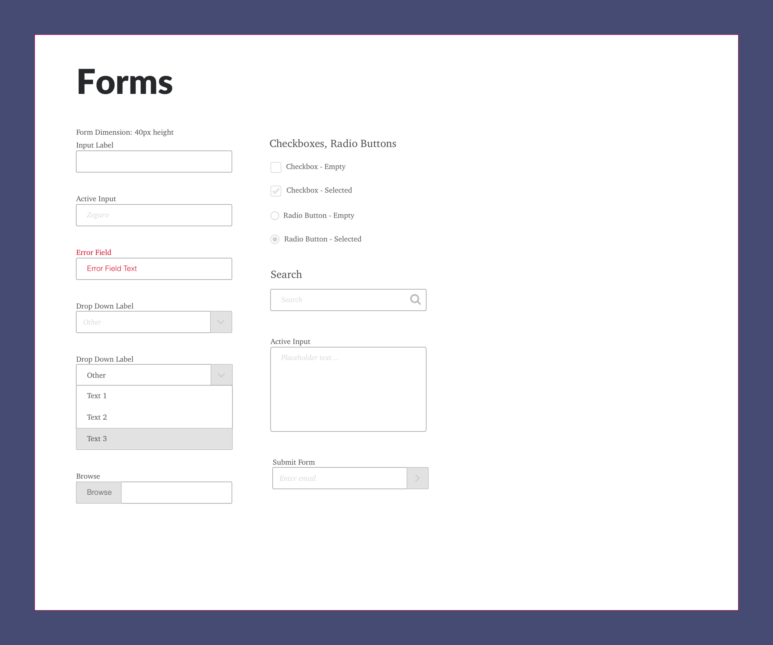
Define | Style Guide
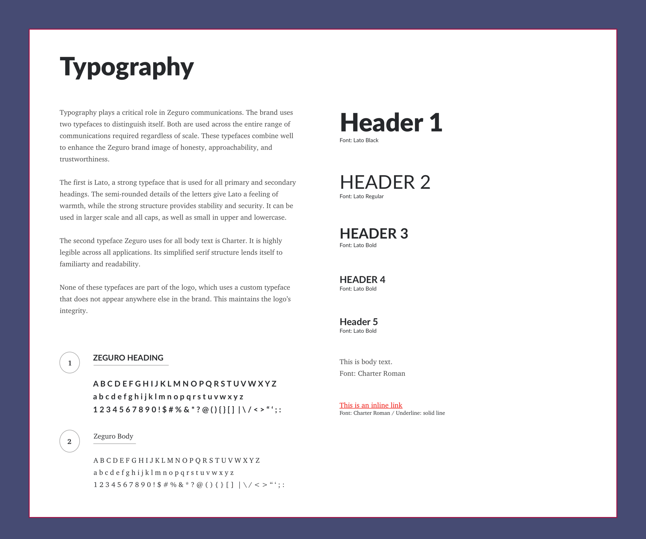
Taking the design principles and founders' input, we established a set of standards to give the brand definition. I focused on the typography section because I was interested in the critical role type would play in the company's overall impression. I chose two typefaces to distinguish Zeguro's brand that combined well to enhance the brand image of approachability and trustworthiness.
The first is Lato, a strong typeface used for all primary and secondary headings. The semi-rounded details of the letters give Lato a feeling of warmth, while the strong structure provides stability and security. It can be used in larger scale and all caps, as well as small in upper and lowercase.
The second typeface Zeguro uses for all body text is Charter. It is highly legible across all applications, and its simplified serif structure lends itself to familiarity and readability.
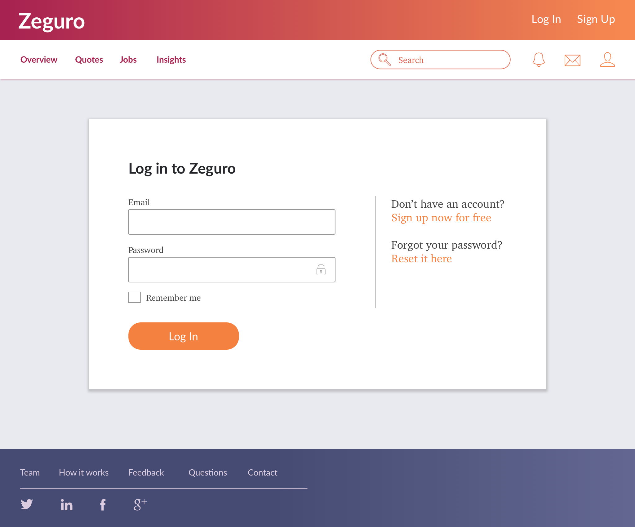
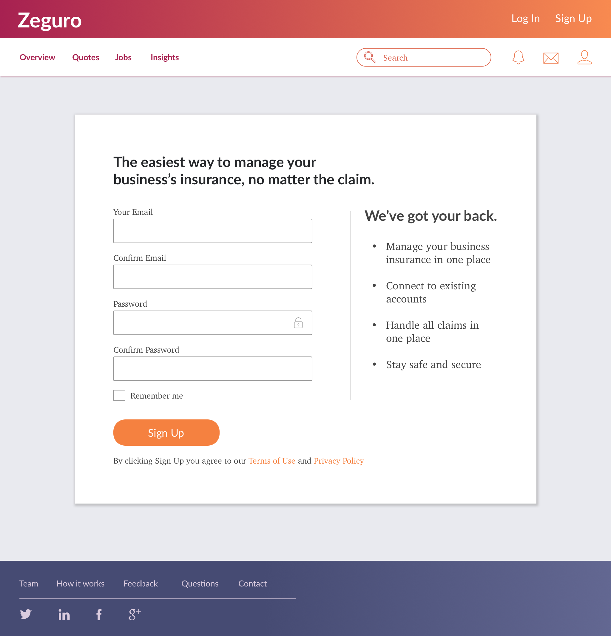
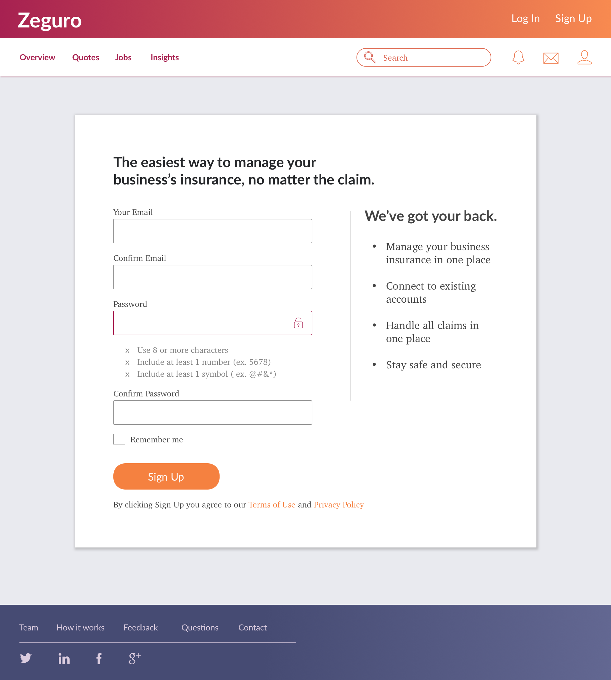
Visual Design | High Fidelity Wireframes
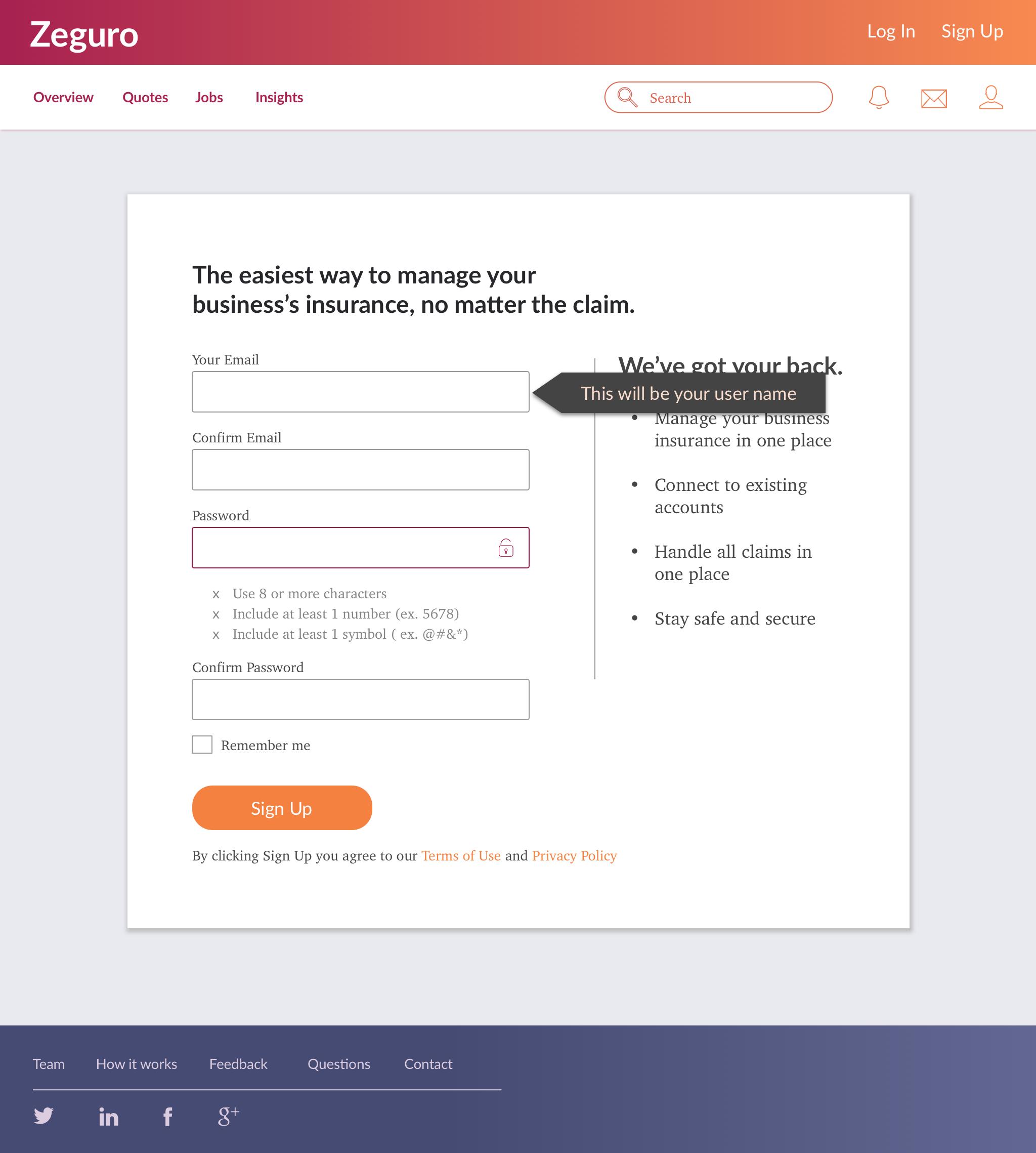
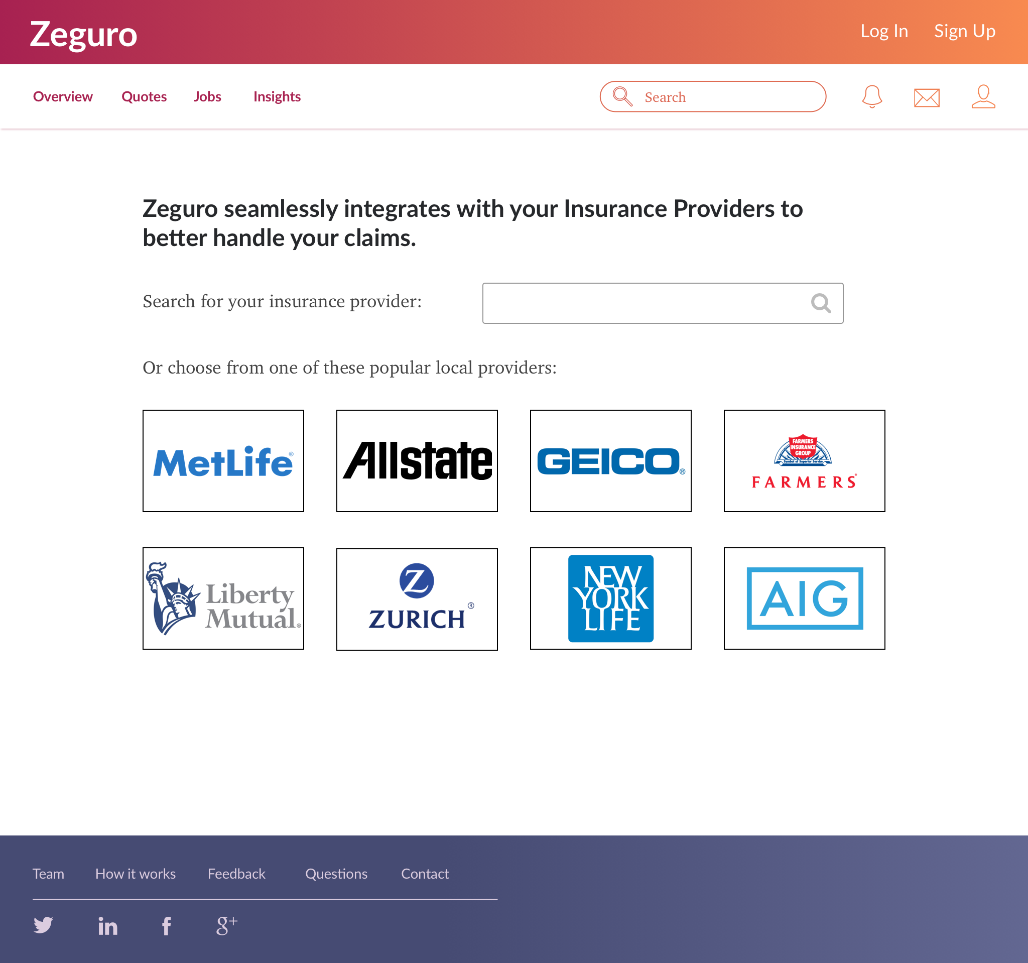
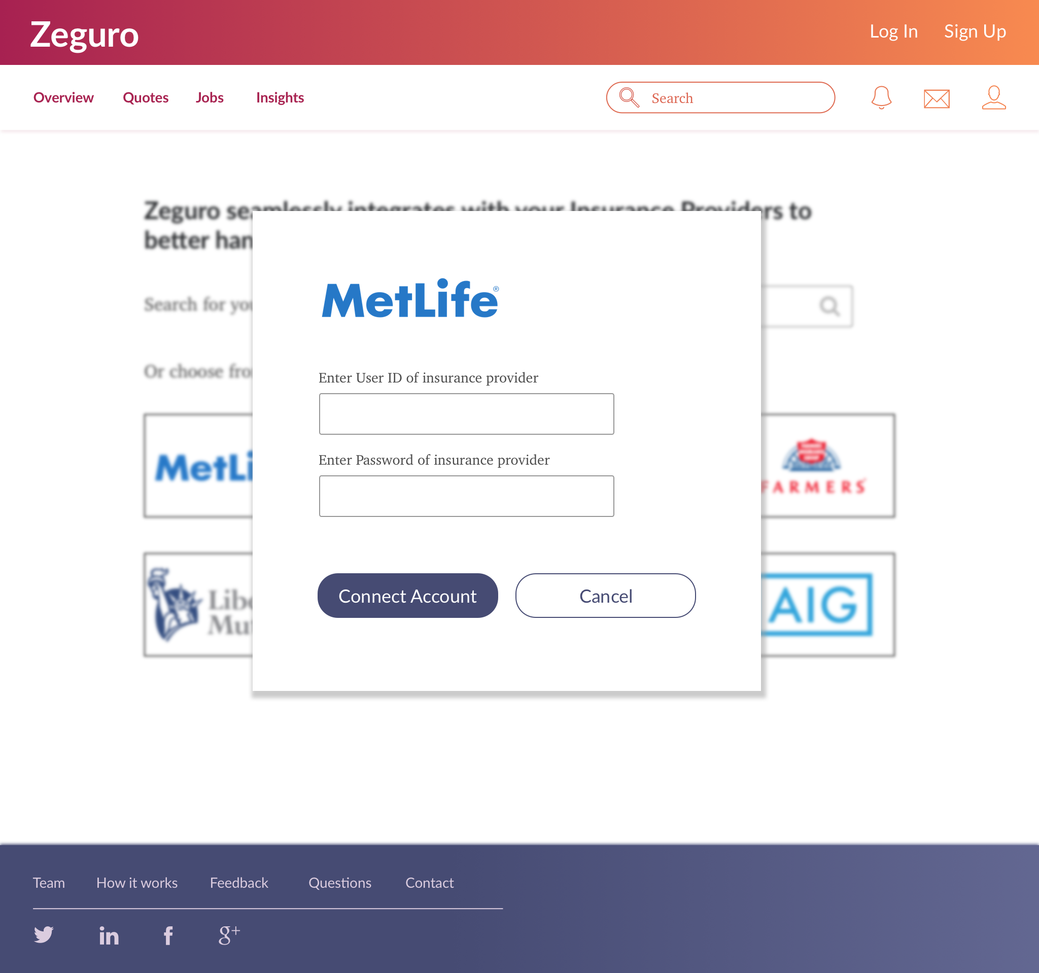
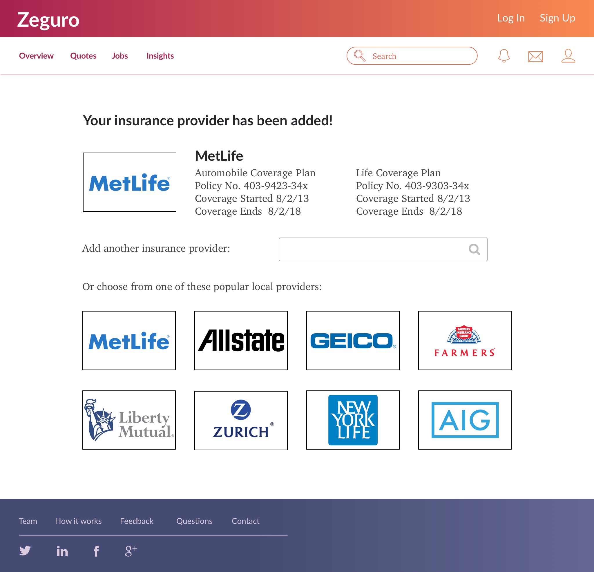
Although still in the development phase, we wanted to apply our visual design to Zeguro to provide the founders with a sense of the product's overall look. We took the low-fidelity wireframes for the on-boarding flow and designed those screens using the style guide and component library.
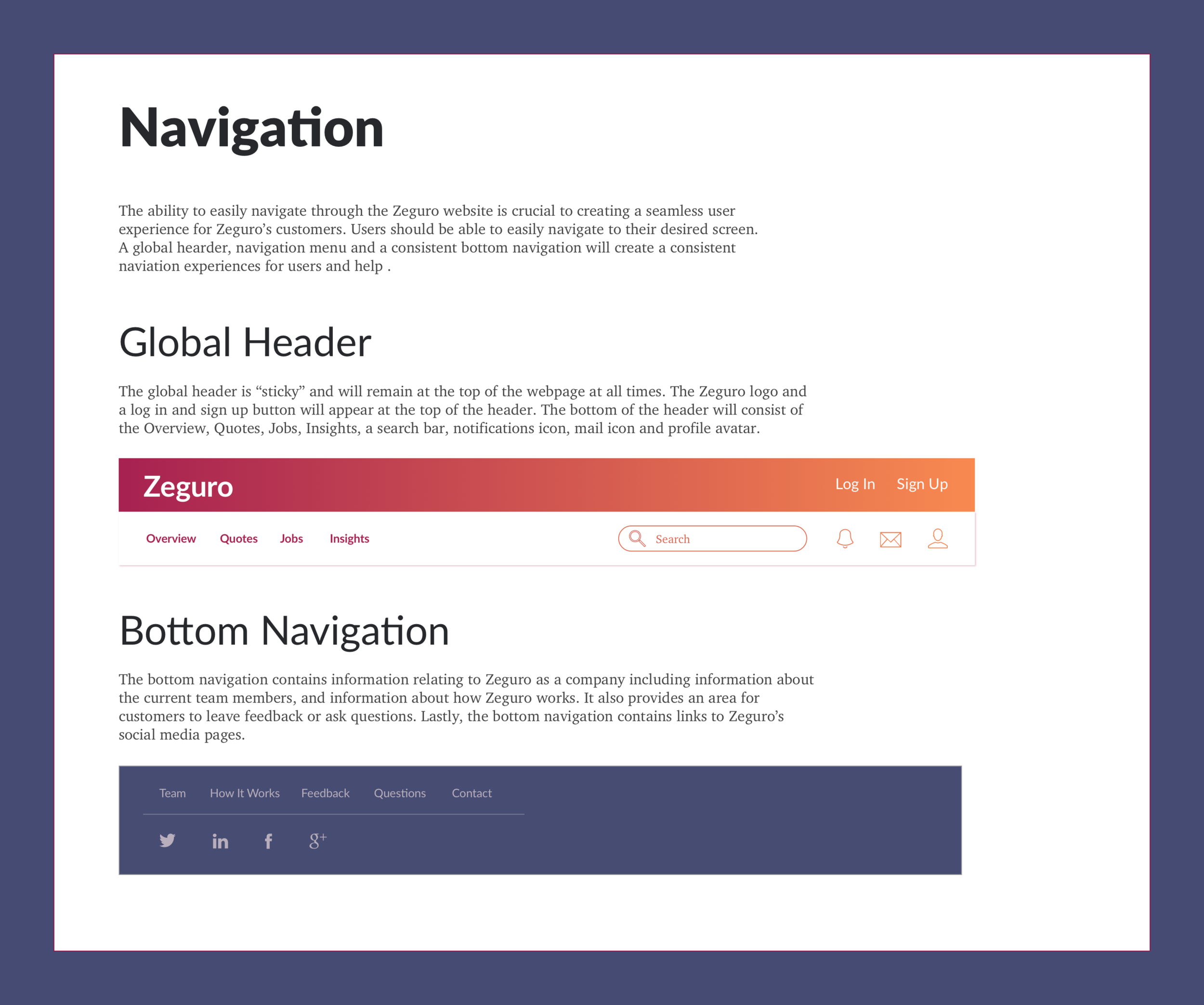
To kick things off, we started with the basic structure of the site designing the global header and footer. People were immediately drawn to the bright colors so we decided to go with the highlight colors for the header as they felt more approachable. We reserved the somber blues and grays for the footer to give the site a solid grounding.


We wanted to present a tangible product to the founders to bring the branding to life and provide the developers with a visual reference while coding. We designed the first several screen in the on-boarding flow giving a lot of thought to translating the energy of the brand across the site as well as clearly communicating Zeguro's value proposition.
Visual Design | Hand-off to Developers
To help engineers with front end development as they built out the product, we delivered our designs using two efficient methods. We designed on an 8-point grid so our UI would be easy to convert to code. To hand-off our specs to developers, we used Sketch Measure to show key measurements and Zeplin to easily pull assets and CSS elements.


Design Reflections
This visual design project was an incredible experience in terms of exploring ways to communicate a new, innovative product in an established industry. Since we were starting with a completely blank slate, it was important to work closely with the founders from the beginning to steer the brand in a direction they would not only be happy with visually, but also effectively represent the brand value and highlight the service it provides within the insurance space.
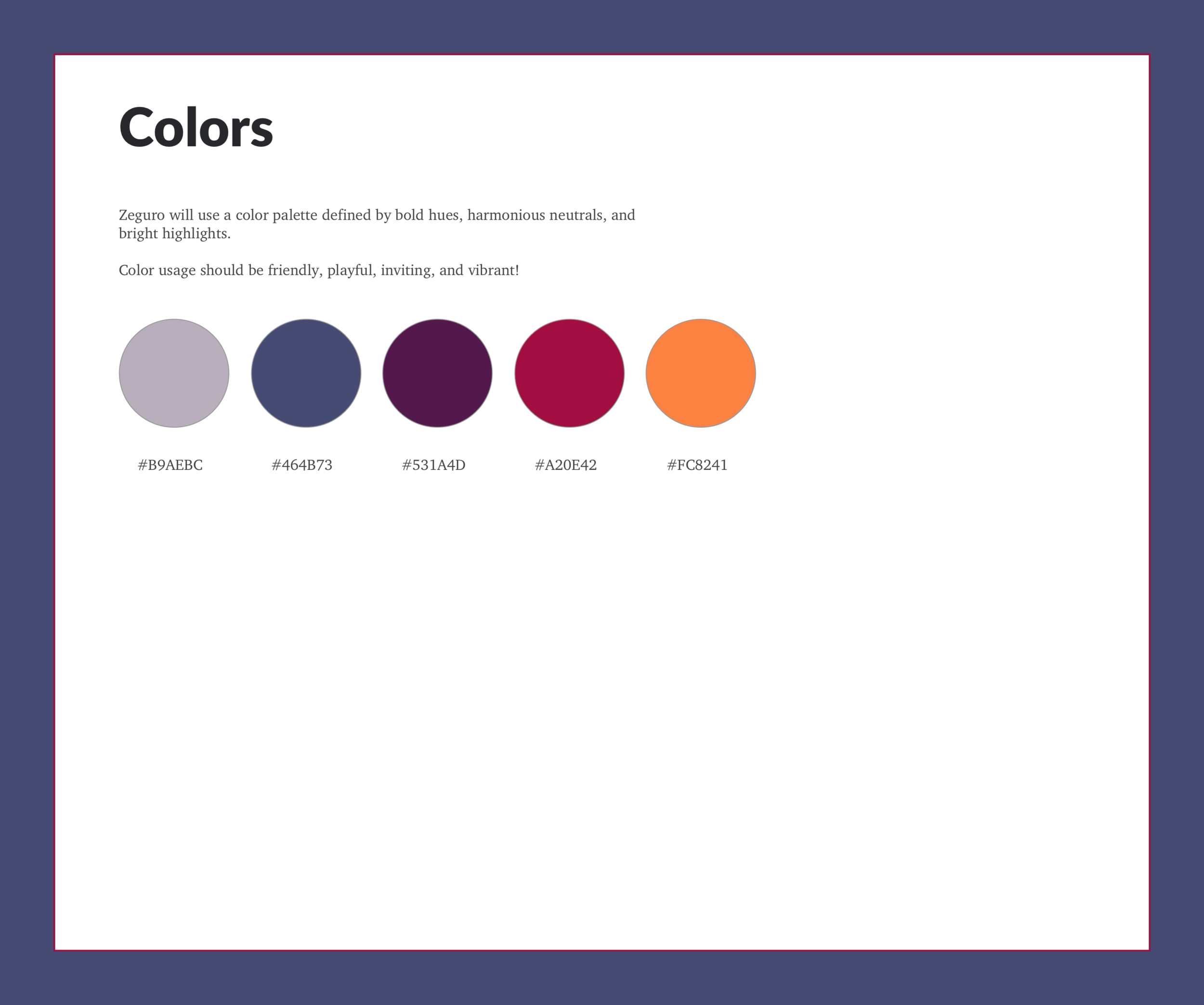
One of the trickiest issues was developing a brand that stood out from other traditional insurance companies while conveying the conventional principles of both security and trust. Our decision to go with a more playful color palette provided for a fresh take in the insurance space while still allowing us to communicate the brand's more conventional values throughout its design.